⚡ Summary
A landing page is one page built for one goal (order, buy, sign up). A website is several pages built for the whole business: services, blog, catalog. A landing page is faster and cheaper, but it won't replace a website if you have more than one offer or direction.
Almost every week someone reaches out saying "build us a landing page" — and ten minutes into the call it turns out they actually need a full multi-section website. And the reverse happens too: someone orders a "5-page site" while selling one specific product, when a single strong page would have done the job. Confusing the two formats costs money — either you overpay for sections you don't need, or your offer gets diluted where a single clear action was supposed to live. Let's break down what's what.
What a landing page actually is
A landing page (also called a single page website) is a single page built around one goal. Not "about us," not a "services catalog" — a specific offer: book a consultation, buy a course, register for an event. Headline, benefits, testimonials, a call-to-action button — the entire page structure leads the visitor toward ONE action. There's no ten-item navigation menu to get lost in — there's one path down the page to the sign-up form.
What goes on a landing page
So what is a landing page made of, block by block? The order of blocks varies, but the logic holds: first the offer, then reasons to trust it, then the form.
- The first screen. A one-sentence headline with the offer, a short subheadline and a button. Many visitors never scroll further, so they should get it right away.
- The problem and the benefits. What the product solves for the customer. "Book without phone calls" is easier to grasp than "a convenient booking system."
- How it works. A few steps from request to result, so people know what happens after they click.
- Proof. Reviews, photos of past work, case studies. Anything the visitor can check.
- Answers to doubts. Price, timing, guarantees, what happens if it isn't a fit. Often a short Q&A.
- The final call to action and the form. The same action as on the first screen, with as few form fields as possible.
The button usually appears several times down the page, so nobody has to scroll back up once they've decided.
How a landing page differs from a multi-page website
This landing page vs website comparison comes up almost every time we talk to a new client, so here's the short version.
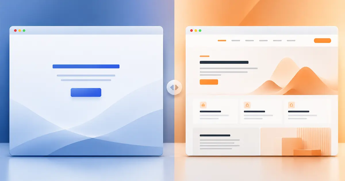
- Number of pages. A landing page is one. A website is however many you need: services, blog, portfolio, a separate contact page.
- Goal. A landing page sells ONE offer. A website represents the business as a whole and can lead to several different actions at once.
- Navigation. A landing page has no menu leading "away" — only anchors to sections on the same page. A website has a full menu with page-to-page navigation.
- SEO. A multi-page site has a better shot at ranking for dozens of search queries — each page targeting its own intent. A landing page usually runs on paid traffic or a single specific search phrase.
- Timeline and cost. A landing page is faster and cheaper — less content, a simpler structure.
Not sure which format you need?
Tell us what you're selling and where you plan to drive traffic — we'll tell you whether a landing page is enough, or whether you should plan for a full website from the start.
When a landing page is the right choice
A landing page is the right call when:
- You're launching ONE product, course, or promotion and don't want the visitor's attention split.
- You're planning to run paid ads (Google Ads, Meta) to the page — the ad and the landing page should say the same thing, with no extra clicks sideways.
- You have a one-off event — a webinar, a sale, a cohort enrollment — with a clear date and deadline.
- You need to quickly validate an idea (MVP): whether people actually buy the product, before investing in a full website.
Types of landing pages
Landing pages differ mainly in the action they ask for.
- Lead generation. The visitor leaves a name and phone number, and a manager calls back. Common for services like home repairs or tutoring.
- Selling one product. The page leads straight to checkout, with no catalog around it.
- Event registration. A webinar or the start of a new cohort. Here the date and the number of seats should be visible right away.
- A free resource in exchange for an email. A checklist or a free lesson for an email address. This is called a lead magnet.
- A waitlist. The product isn't out yet, and the page collects contacts of people who want to hear first. A simple way to test demand.
Landing page examples
The simplest example is a webinar sign-up page: one date, one form, one "register" call-to-action. Another common example is a one-off course or workshop page, where the entire structure leads to a "buy access" button. For services, it's often a page built around one specific promotion, like a consultation discounted until the end of the month, rather than a general overview of everything the company offers.
Common landing page mistakes
- Several offers on one page. With three services and two promotions side by side, people don't know what to pick and leave.
- A headline about the company. "In business since 2010" says nothing about what the customer gets. The first screen should answer "what's in it for me?"
- A long form. A name and a phone number are often enough for a first contact, and every extra field costs you requests.
- The ad promises one thing, the page shows another. If the ad mentions a 20% discount, the visitor should see it right away.
- Links that lead away. Social icons or buttons to other sections pull visitors off before they fill in the form.
- Slow loading on phones. Many people tap through from ads on a phone. Heavy videos and uncompressed photos make them leave before they see the offer.
When a landing page isn't enough
If you have several services or product categories, need a blog for organic traffic, or customers search for you by brand rather than by a single promotion — a landing page will feel too narrow. One page physically can't hold structured information about 7 different services, let alone blog articles that keep pulling in traffic for months and years. In that case you need a full multi-page website — the same format we built for ourselves, by the way (just look at the menu above). How much a site like that costs and how long it takes to build is covered in a separate article.
Landing page or website: a few questions to decide
Still unsure? Try answering four questions honestly.
- How many offers do you have? One points to a landing page. Several services need pages of their own.
- Where will visitors come from? Paid ads pair well with a landing page. Long-term Google traffic needs pages for different queries and a blog.
- How long will the page live? A one-month promotion suits a landing page. A business built for the long run is better off with a website.
- What do you want to test? To check demand for an idea, start with one page and build the website after the first sales.
If most of your answers point to a website, take a look at how website development at LuloTech works.
How much it costs and how long it takes
Thanks to its simpler structure, a landing page is generally both cheaper and faster than a multi-page website — exact numbers, stages, and timelines are broken down in what actually goes into building a landing page. In short: LuloTech's base website-development package covers both formats — a single strong page or a full multi-page site — depending on what your business actually needs.
For a short definition of the term, see the glossary.